To try to address this question I would like to use the context of the little-known history of printmaking in Stavanger, and the region’s contemporary developments in printmaking. What will we find if we use artistic printmaking as a lens through which to read the story of the city’s physical and intangible developments? A city whose discourse in the past 50 years has been dominated by the oil industry.
Large scale printing in Stavanger
Presently, this question seems to present itself more willingly, as we are in the process of seeing a new graphic museum open in the city of Stavanger. The former graphic museum, previously housed in the harbor area of the city, has shut down while waiting for a new building and exhibition program set to open in 2020. According to the museum, they will include “themes concerning the printed word and image” and the proposed exhibitions will have a focus on local history, including exhibition concepts such as “The written word” and “From paper to screen-based mediums”. From the presentation given on the website, and the previous intentions of the institution, it’s likely that the new graphic museum will serve more of a cultural historic purpose than cater to an artistic perspective.
One main focus for the graphic museum will be the rich design aesthetic developed alongside the canning industry in Stavanger. In the prime era of print in Stavanger, roughly in the latter part of the 1800s and early 1900s, almost 40,000 individual designs were made for hermetic goods (some claim up to 60,000). These designs were given the name iddiser, a word loosely adopted from the Norwegian word ‘etikett’, meaning label. Apparently, one of the main printing firms in Stavanger could print up to 3 million iddiser a week in the early 1900s. In the region, iddiser quickly became collectible items and today they’re still a favorite with people prone to collecting. Mainly litho-printed, both the image and text of the designs were hand-drawn. Thus, these designs mark a rich contribution to Norwegian typographic and graphic design history.
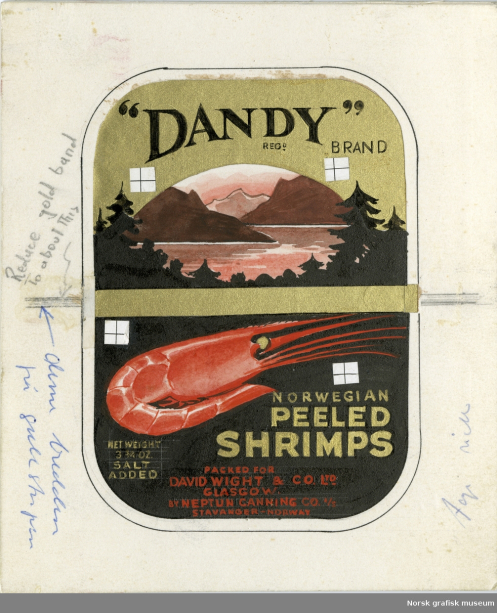
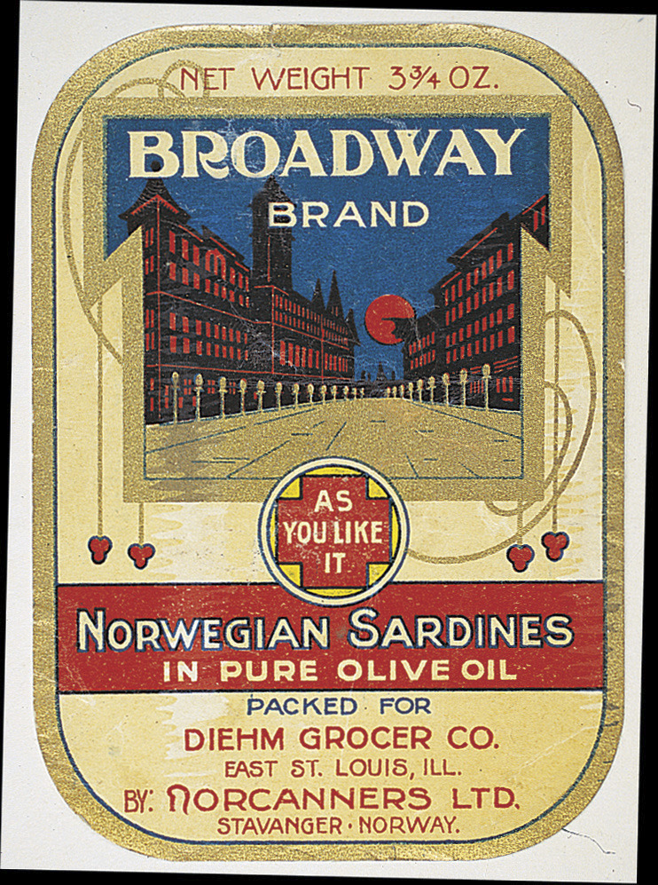
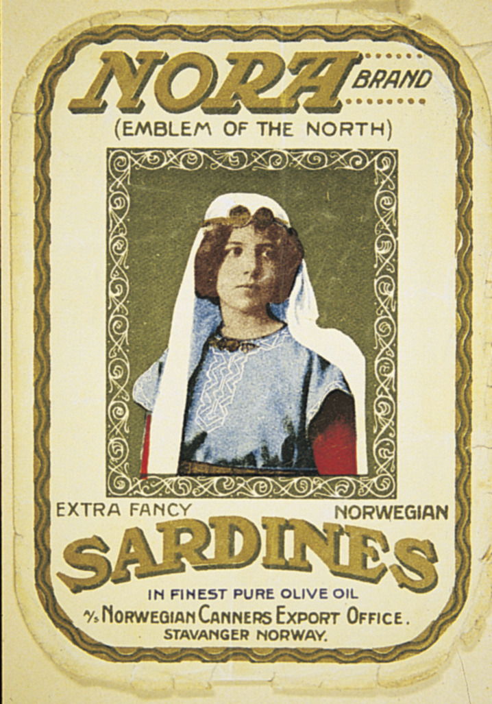
It goes without saying that these designs weren’t restricted to Stavanger but travelled, shipped around the world from the printing presses of this Norwegian city. The designs were also specified in terms of appealing to their designated locations. Some classic examples are the Dandy design, made for a Scottish product of Norwegian shrimp, and The Broadway Brand, made for East St. Louis, Illinois in the United States – which depicts a city avenue in a four-colored litho print with hand-lettered type and a looming moon lighting up the street underneath (presumably Broadway). Another classic is the Nora Brand (emblem of the North), with the subtitle “Extra Fancy Norwegian Sardines”. There’s Holmen’s which today is mirrored in Lervig’s Betty Brown design, where it markets beer instead of selling herrings.
It is also worth noting that some of the work that was done was not signed, as was custom of illustration, type and design work at the time. It was rather seen as belonging to the corporation that employed the designer. Contemporary collectors have worked to index the iddiser and retroactively author them.
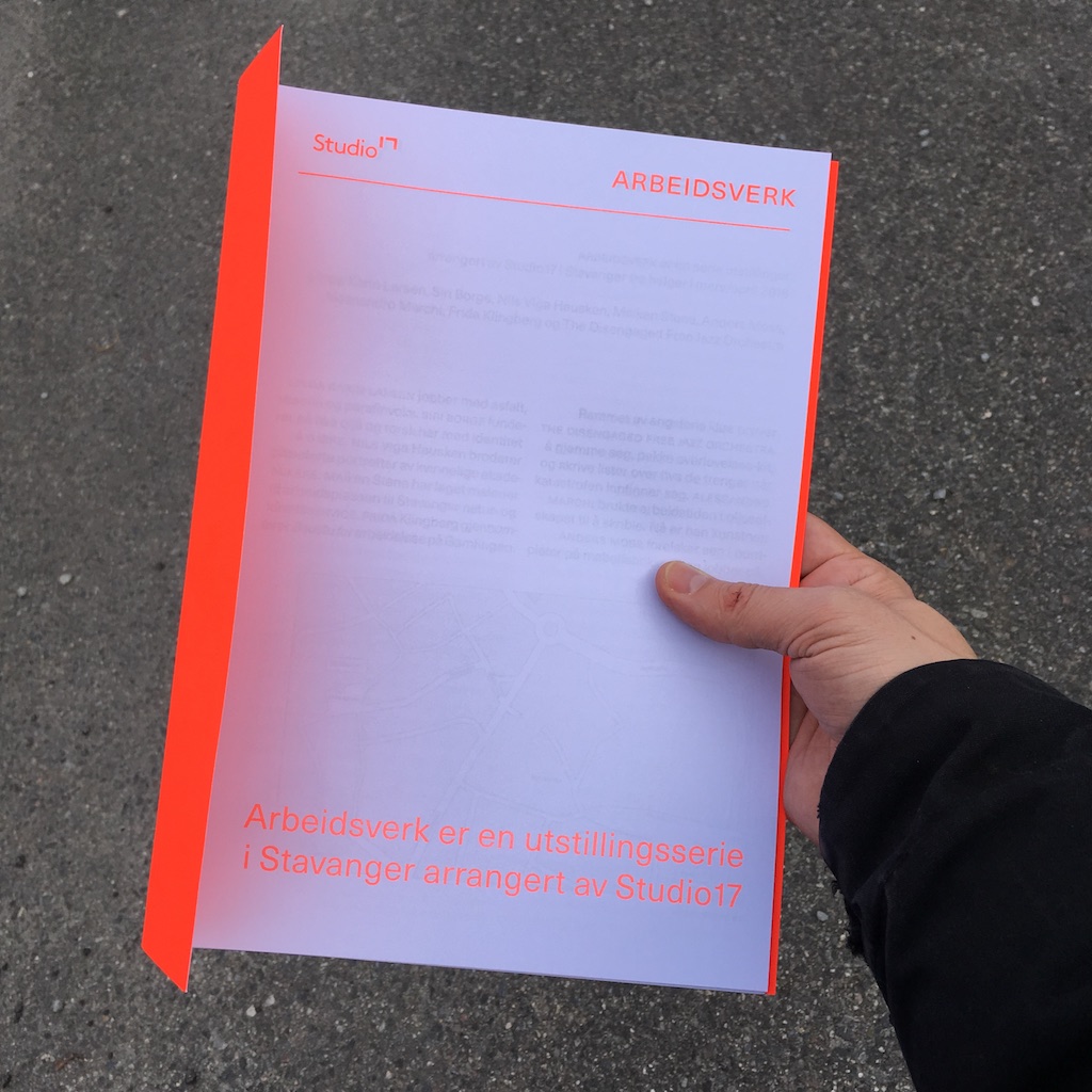
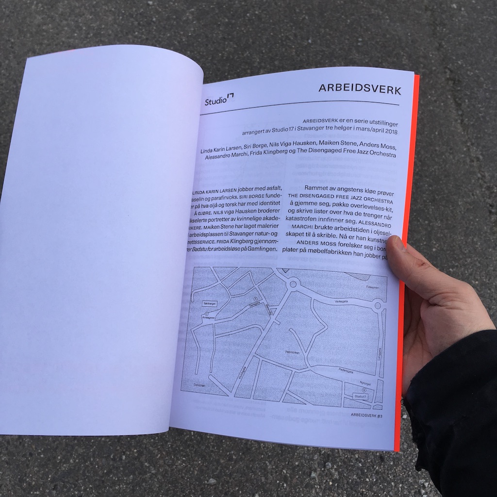
In Stavanger, large-scale printing activity died out together with the corporate fishing industry sometime in the mid 1900s, and today Stavanger is more known for being the hub of the oil extraction industry. However, printing is still alive in the city – though not in as large quantities as before. And one key component has changed. Today’s printing activity is fueled not by large organizations or corporations, but rather by the artists and designers themselves.
“The freedom of the press is guaranteed only to those who own one”.
Publishing as regional activity
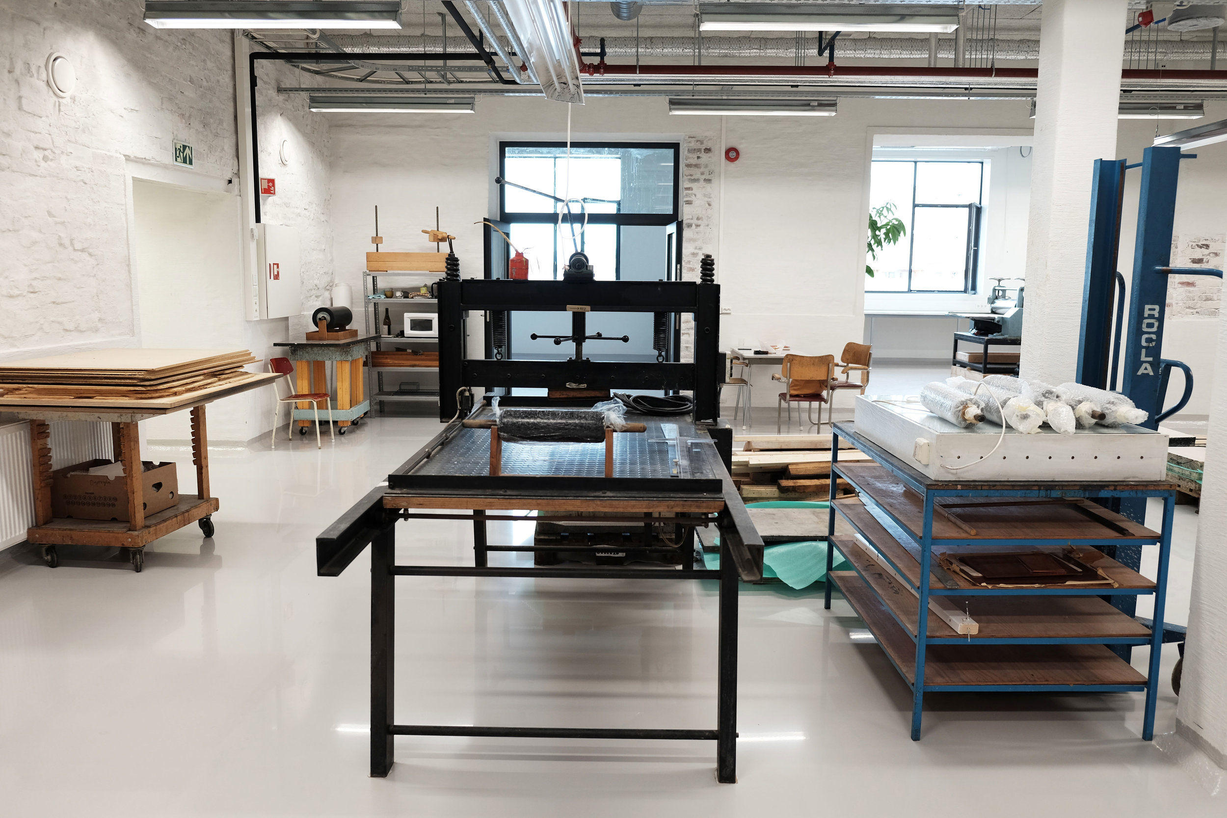
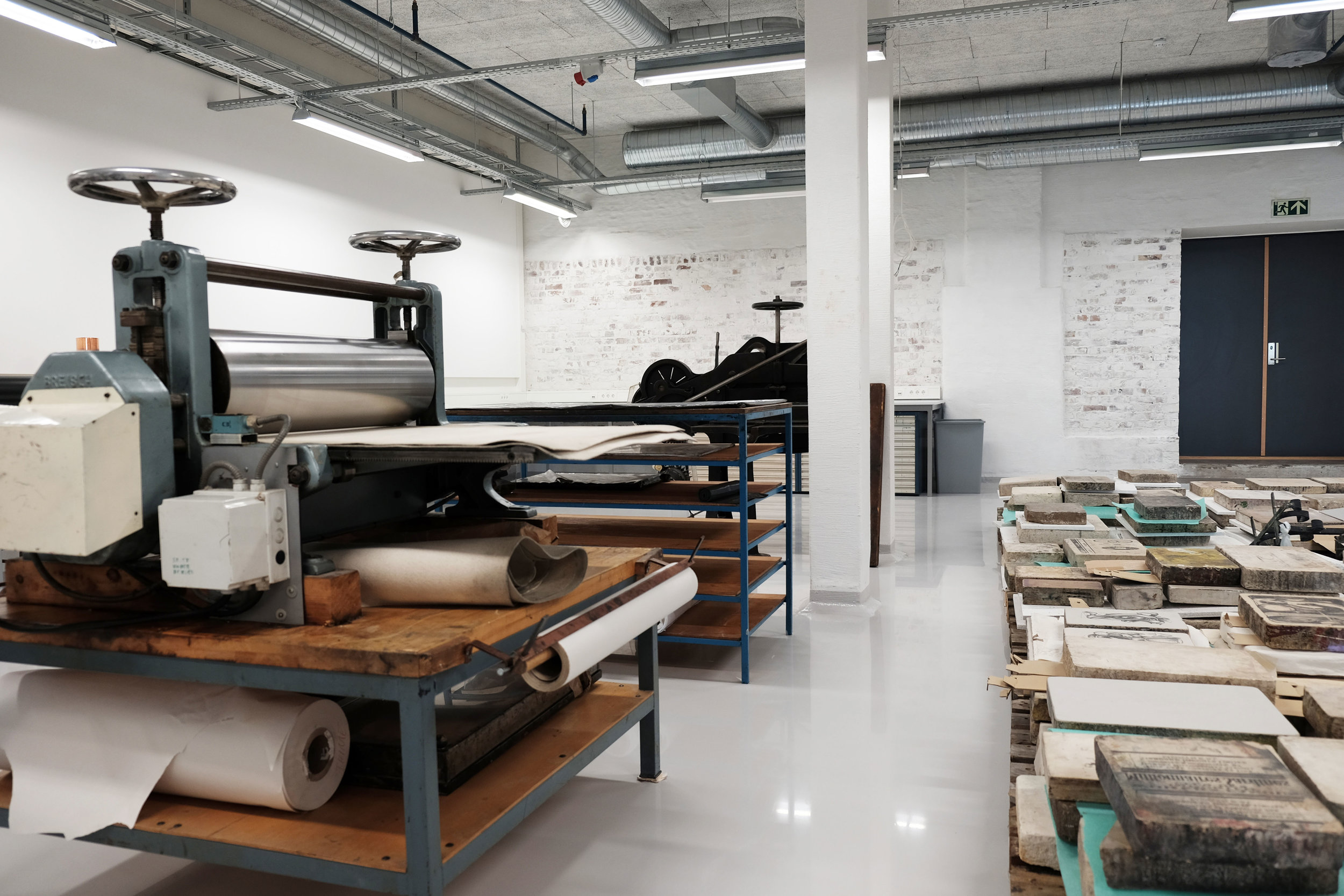
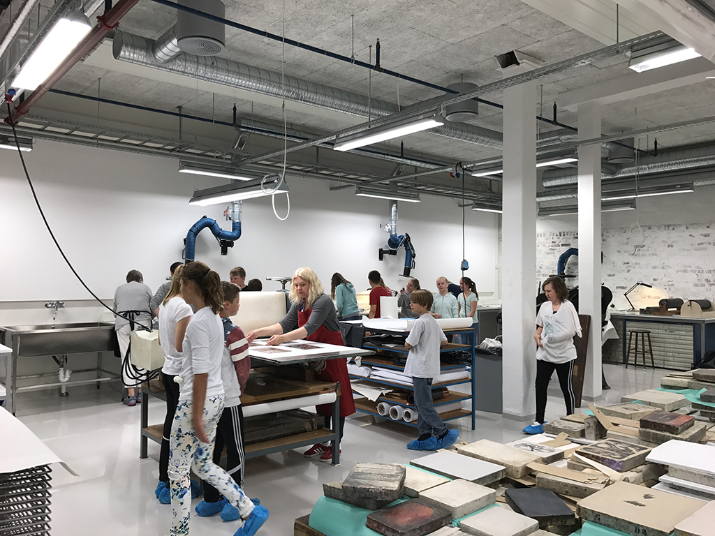
In the eastern part of Stavanger the art workshop Grafisk Verksted, recently re-opened in new and larger spaces under the new name Tou Trykk. The printing studio, which mainly caters to artists and designers, includes machines that enable practitioners to use lithography, engraving, wood cut, silk screen printing, photo and digital print. On the workshop’s Facebook page you can see images of local artists engaging in silk screen and wood cut works depicting everyday scenes from the local region – from industrial buildings to details of waves. The workshop’s regional presence, its low-scale production quantities, manageable pricing, and its relationship with local artists of many different ages gives Tou Trykk a democratic aspect.
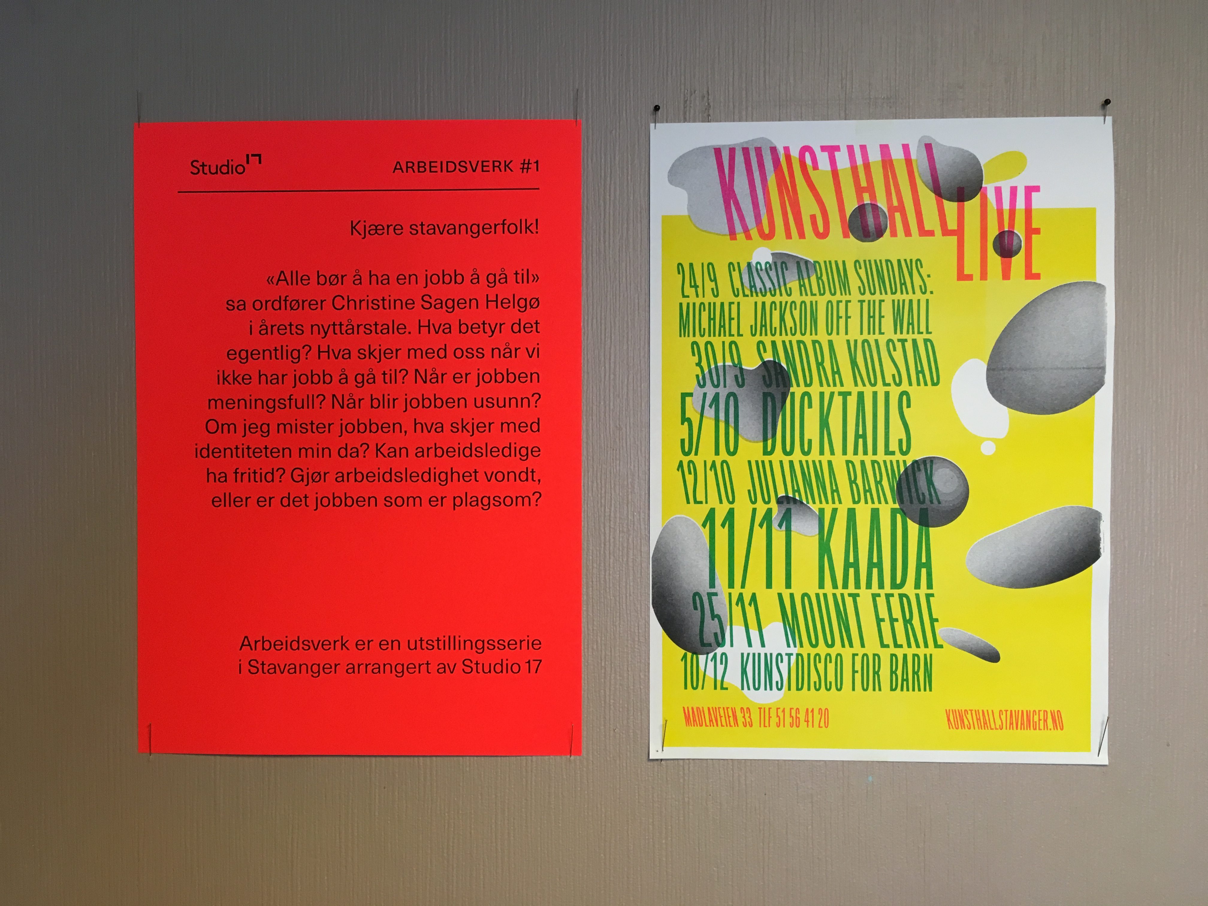
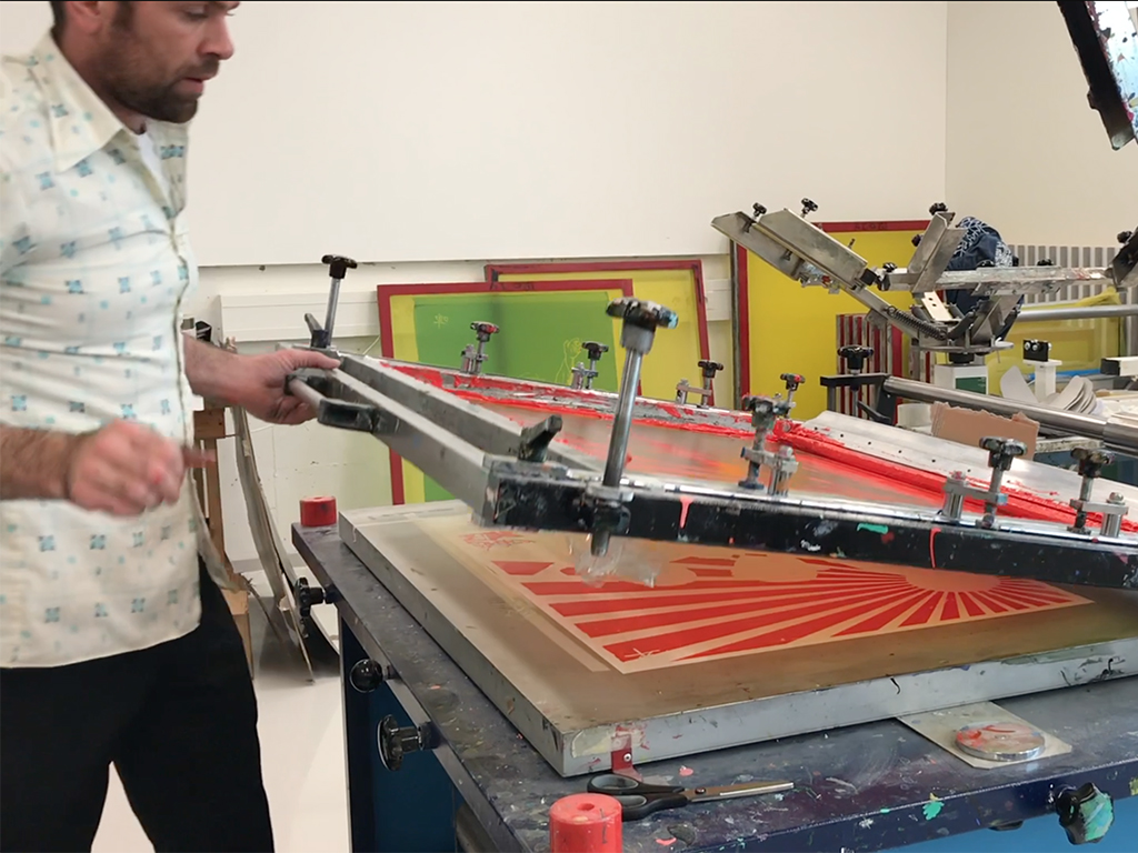
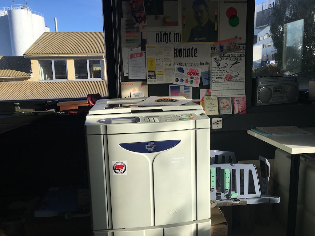
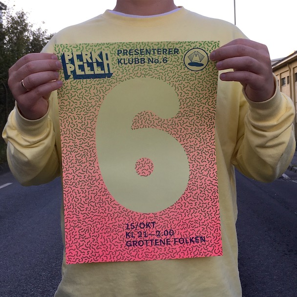
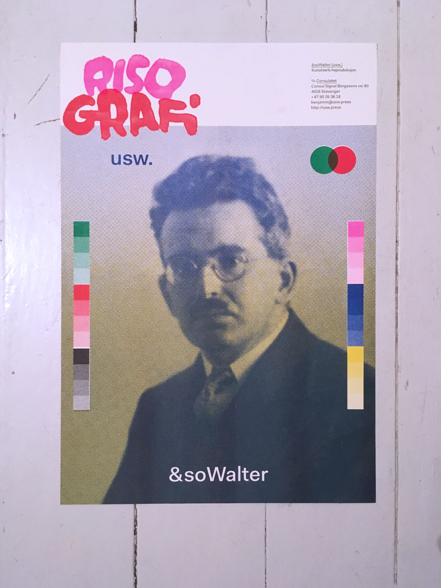
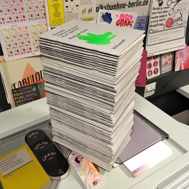
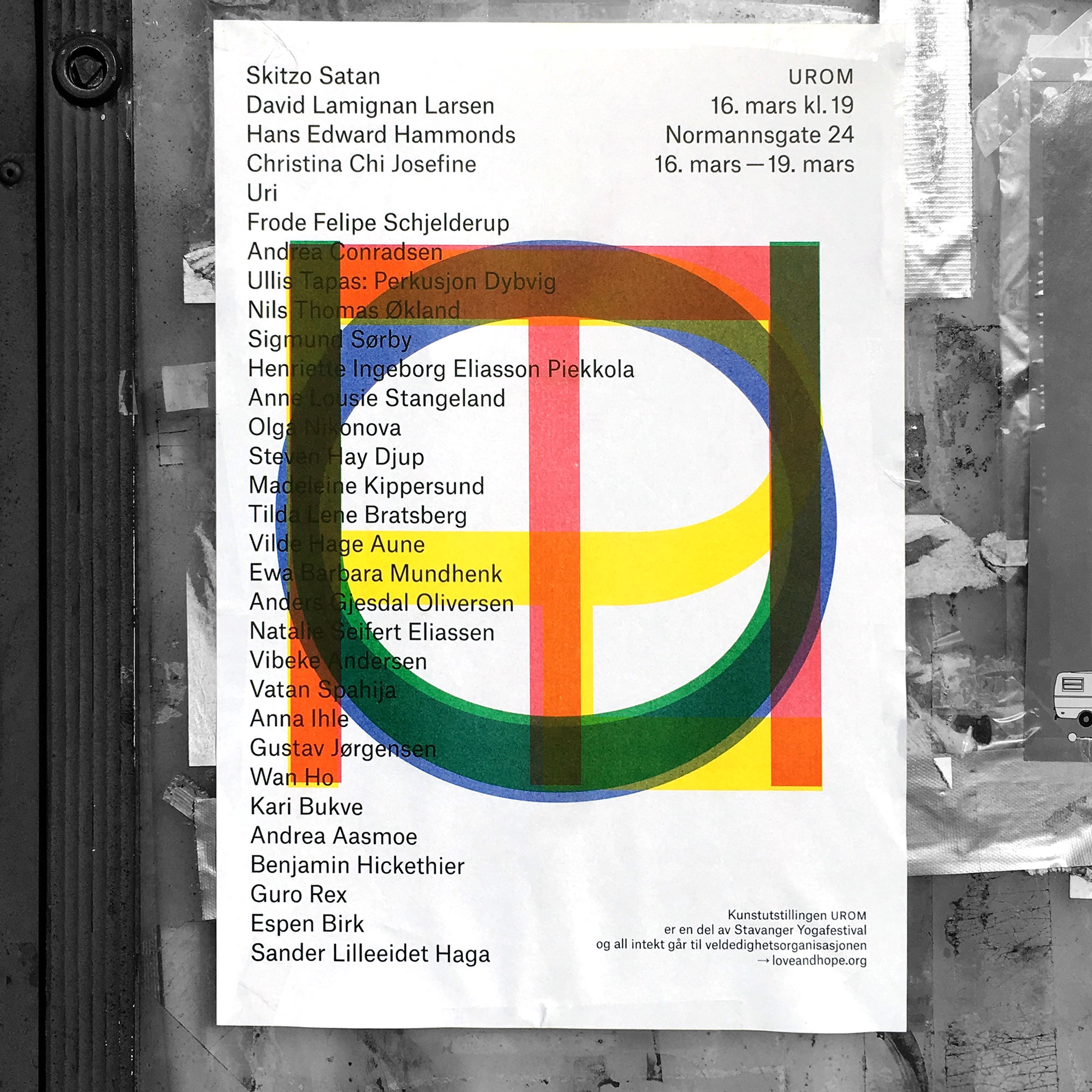
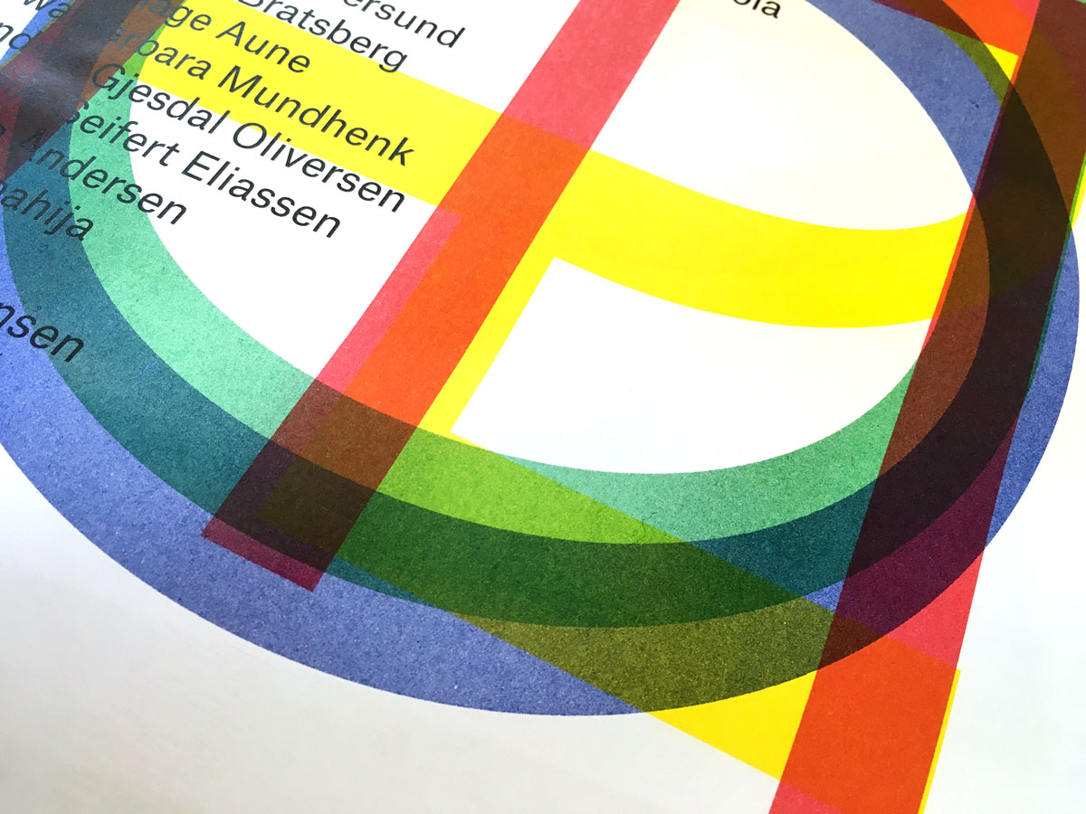
On the outskirts of the city, graphic designer Benjamin Hickethier runs the RISO workshop &soWalter (usw.). The RISO machine was originally invented in Japan in the 1980s to produce high quality prints without the need for a big printing house. It also had a short claim to fame in the US church scene where it was used to produce large quantities of programs, posters and info leaflets for the congregation. And now one of them has made its home in the Hillevåg area of Stavanger. The machine, which at first glance looks like an any ordinary 1980s printer, has become increasingly popular in both graphic design and fine art circles due to its idiosyncratic printing aesthetic and manageable budget. Hickethier’s designs, which he also prints on the RISO, include everything from artists’ poster series to flyers for Classic Album Sundays at the Kunsthall in the city. What tends to unite the wide variety of his work is the color pallet available. The RISO’s specific aesthetic expression is unmistakable and can also be customized by the person operating the machine. The designer may choose specific made-for-RISO colors, thus creating their own trade mark through the prints regardless of the author of the original design. In this way the RISO operators themselves become co-creators of any work done on the machine. Hickethier’s use of the machines fluo pink, as well as the metallic gold, sends a visual message to the local population of its origin in his studio. The idea of uniting work through its color scheme and production methods gives us another perspective on the act of printing, not only as instrumentalized production but also as an autonomous and artistic process. In this we can read the political stance that often goes along with these types of printing initiatives, of shortening the distance between idea and production, from output to distribution, cutting out any middle person or larger organization, and fully taking control of one’s own output.
In regard to this way of thinking of print, the famous quote from the American journalist A. J. Liebling comes to mind: “The freedom of the press is guaranteed only to those who own one”. In printing your own work, you hold the freedom to express yourself. You can produce your work and control it to the point where it starts speaking to your audience (no interventions necessary before that). The act of printing your own work, and of self-publishing can be seen as an act of silent activism. And in some cases: loud, border-eroding activism.
Activism in print
If we look back at Western European history, much of the narrative of printmaking has been tied to the streets. Historically, posters, flyers and leaflets are tools for spreading information in public spaces. On a different political scale, Stavanger’s iddiser was in the mid 1900s exchanged and played with by both kids and adults as currency, often on street corners, playgrounds or other public spaces.
I would like to quickly look to the city of Amsterdam; a city known for its graphic design and artistic output. In 2012 the Korean journal Graphic (#24, 2012) chose to focus on the city and dedicated a long interview to the design studio Experimental Jetset. Here the studio talked about their work with the Provo movement, which was based in Amsterdam from 1965-67. At the core of the activist and anarchist movement was the act of printing.
Provo operated an illegal printing press, which had to be moved intermittently, and in this way – in the legacy of Guy Debord and the Situationists – created a derivé through the city; an experimental and emotional charting of urban space. The city became a canvas for the press, and the press in turn produced material to canvas the city.
In the article, Experimental Jetset talks about how the Provo movement prepared smoke bombs to be used during protests, as if “imprinting” on the city itself. They address a photo of two people preparing these bombs and how the fact that both of the people in the photograph are printers, speaks to this idea.
To see printmaking as an activist tool is not a new concept, but to think of print in this expanded field of urban imprinting, opens up questions that are interesting to explore within the context of Stavanger: How does printmaking play a role in changing our perception of a city as a space for culture, art and activism? And how does printing re-shift ideas concerning politics, art and design today? These questions direct our focus away from the technical aspects of printmaking, and onto the more subtle artistic and intangible qualities of print.
In their own artistic statement, Tou Trykk says they make room for research, for experimentation and for artists to go deeper into specific printing techniques. In addition, they teach artists and designers how to operate the machines, granting them larger autonomy through the printed medium. In the same capacity, the RISO workshop run by Hickethier has a research potential inherently tied to the RISO as artistic tool. There is still much potential left unearthed as the machine was quickly retired in the age of the desktop publishing. Recent years have seen conferences such as Magical Riso at the Jan van Eyck take place, where participants shared knowledge of the technical aspects of the machine as well as its artistic potential. In printmaking, both the written word and the form itself becomes critical mass, because it is made to communicate and to be in dialogue with an audience, transmitting the message of the designers and artists. And when it is not serving the instrumental need of a corporation, the need for and use of the printing press becomes a message in itself.
“The city became a canvas for the press, and the press in turn produced material to canvas the city.”
Printmaking’s impact
Printmaking inhabits many aspects in terms of being a tool strictly used to communicate as well as an artistic instrument and method. It inhabits everything from the newly discovered markings in Spanish caves where Neanderthals are believed to have used their hands as stencils, a primitive form of printmaking, to sophisticated printing methods used in lithographic presses in Stavanger. But as with the early printmaking gestures on the cave wall in Spain, to the work produced in Stavanger today, the one constant is the artistic potential and the innately human desire to influence and make a mark on our surroundings.
These more nuanced aspects of print, not only as technological output or instrumental tools for communication, are perspectives that would be a very welcome experience when the new graphic museum opens in two years. Hopefully we’ll be able to visit a museum that not only presents the scientific, cultural history aspects of graphic print, but that also embraces the artistic perspective and printmaking’s potential to impact individuals and societies on intangible levels.
Kristina Ketola Bore (1986) is a design critic, editor and educator based in Oslo, Norway. She is a co-founder of The Ventriloquist Summerschool and works as a critic, writer and subeditor of the journal Periskop. She lectures internationally on the topic of critical thinking in design.