Please scroll down for English
Det er lenge siden design gikk bort fra ideen om at det fantes ett universalt svar på visuell kommunikasjon, og med den la også de fleste designere igjen modernismens prinsipper. I grafisk design er de modernistiske formene definert av blant annet rutenettverk, grunnformer og -farger og groteske typesnitt 1
- En font er en del av et typesnitt. For eksempel er Helvetica Bold pkt 12 én font, mens Helvetica Light pkt 10 er en annen font – det overordnede Helvetica er et typesnitt. Helvetica er også et typisk grotesk typesnitt – det vil si at man ikke har seriffer på enden av bokstaver. Andre eksempler er Gill Sans, Futura og Univers. Disse var høyt verdsatt av modernistene.
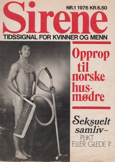
Her i Norge hadde modernismen et stålgrep på designfeltet langt utover 1970-årene. Noe vi kan se i blant annet det norske tidsskriftet Sirene – sist presentert i utstillingen Hold stenhårdt fast på greia di: Norsk kunst og kvinnekamp (2013) – stilt ut på Kunsthall Stavanger i 2014.
I boken In a Manner of Reading Design (2012) sier Helmut Draxler, tidligere kurator og direktør på Kunstverein Munich, at ideen om design rundt tiden av Ulm-skolen 2
- Ulm-skolen var en tysk skole for design og kunst, grunnlagt i 1953, og som videreførte flere av Bauhaus sine modernistiske prinsipper.
Denne midthundretalls overbevisningen om at designere skal være ansvarsfulle vokste frem i sammenheng med ideen om at design kunne bidra til sosiale omforminger. Designeren var den objektive vokteren av budskapet, men hadde samtidig ansvar for å bidra til samfunnsendring. Her lå det også en idé om det eksistert en korrekte type design, et universalt form-svar. Det kan nevnes at det i all hovedsak var hvite menn som kom opp med de korrekte svarene på designspørsmålet.
Kjønnspørsmålet
Spørsmål om kjønn har alltid fulgt grafisk design, blant annet fordi design er delaktig i konstruksjonen av kjønnsroller. På den måten ligger det implisitt at feltet også kan være del av å bryte dem ned. Fordi design ofte ses på som et serviceyrke, der designeren opptrer som den objektive formidleren – som nevnt en meget utdatert idé – er det for mange vanskelig å forstå at designeren også har sine egne budskap som integreres i designprosessen og produktet.
Disiplinært kan designeren på mange måter ses å gå fra det objektive til det subjektive allerede i 1960-årene. Utover 1900-tallet tar designeren selv større styring over hvordan budskapet kommuniseres, frem til formen på 2000-tallet også blir til innhold. I en nylig presentasjon 3
- Forelesning på seminarrekken The Forms of Politics, som essayforfatteren var medarrangør av. Litteraturhuset Oslo, 23. oktober 2015.
I dag jobber formgivere ikke bare med å formidle feminisme gjennom innholdet, men også å innarbeide feminisme som en del av selve formen. Men før vi kommer til det – la oss se på hvordan designeren har tatt denne reisen.
Formene av Sirene
Redaksjonen skrev om mensen, blærekatarr, og temaer som frem til da hadde vært underrepresentert eller tilbakeholdt fra norsk media. Noen utvalg av titler var for eksempel «Det forkrøpla mannsidealet», «Suzanne Brøgger: Ekteskapet, vår tids kannibalisme», et utvalg av omslagstitler innbefatter: «Skilsmisse på norsk (stakkars pappa)», «Gloria Steinem: Erotikk og pornografi – klart det går å skille», og ikke minst den enkle, men fengende «Orgasme».
Sirene hadde et tofarget trykk med rødt og svart, der den røde fargen kan sies å tilhøre venstresiden, men er samtidig også en farge som har stor tydelighet mot hvitt – som kanskje er hovedårsaken til bruken. Biongs valg av typesnitt gjennom Sirene var en kombinasjon av modernistiske grotesker og antikva typesnitt 4
- Helvetica er et eksempel på et grotesk typesnitt. De går under sans-seriff typesnitt. En seriff er en ekstra dekorasjon på enden av bokstaver. Et typisk (fransk renessanse) antikva typesnitt er Garamond. Alle antikva typesnitt har seriffer.
Sirene presenterer seg som det første tegnet på at formgiverens rolle i feminismens kommunikasjon går fra å være tilrettelegger, til å bli en medforfatter og subjektiv stemme.
Pussy!
Skytende gjennom himmelen! Pussy Galore med sine medsøstre! En ond bande av kvinner i ledtog med en forræder av den frie verden.
Slik fremstilles karakteren Pussy Galore i James Bond-filmen Goldfinger (1964). I filmen vises Galore og hennes medsammensvorne – The Flying Circus – som uavhengige kvinner som har inngått samarbeid med skurken. Goldfinger (som fikk sitt navn etter Enzo Goldfinger, den modernistiske arkitekten bak blant annet Londons Trellick Tower) er en grisk skurk som sammen med Galore planlegger et brekk mot Fort Knox sitt gullager. Gullet skal siden overføres til Sovjetunionen.
Kvinnen som uavhengig person i Bond-universet i 1960-årene er med andre ord en trussel mot den frie, vestlige verden. Galore og hennes sirkus forræder til sist Goldfinger til fordel for Bond. Ifølge Bond-forfatter Ian Flemming er årsaken at Galore som en lesbisk kvinne kun trenger å møte den rette mannen slik at hun kan bli kurert for sin «psyko-patologiske sykdom» – og da altså komme inn på riktig kjøl i samme sleng.
30 år senere skaper designkollektivet Women’s Design + Research Unit (WD+RU) typesnittet Pussy Galore for tidsskriftet FUSE 5
- FUSE kom ut i årene 1990-1996 under redaktør og designeren Neville Brody. Tidsskriftet var en postmodernistisk visningsplattform for eksperimentelle typesnitt. Hvert nummer bestod av blant annet fire fonter og et tilhørende essay.
- Triggs er essayforfatterens tidligere professor.
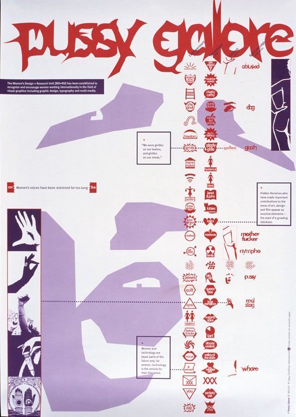
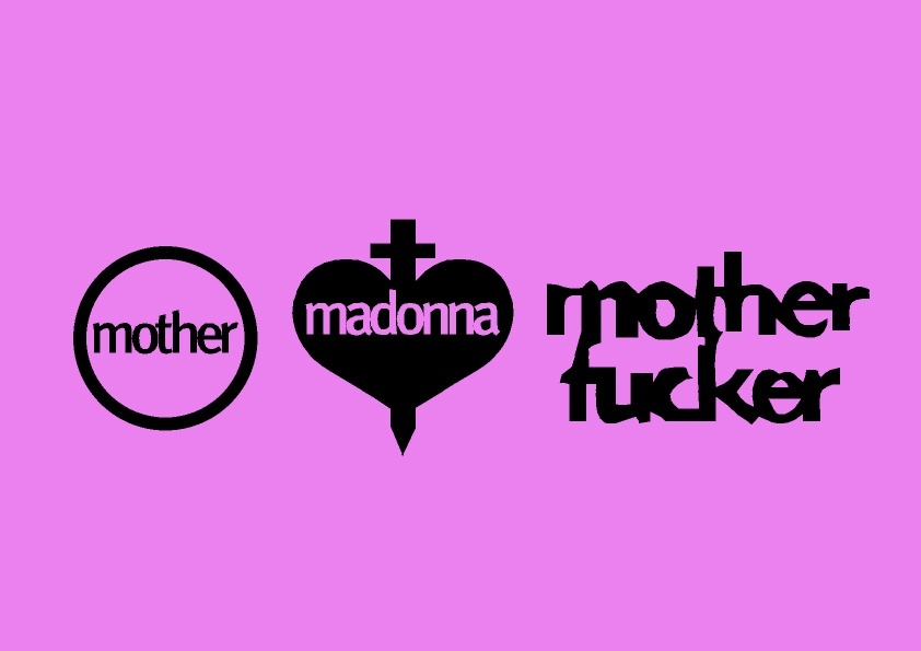
Pussy Galore-snittet bestod av former og ord i kombinasjon slik som Mother fucker, pussy, giggly girly, pin up, power – alle ord som blir brukt til å beskrive kvinner. «This was an opportunity to raise awareness about women working in the profession whilst also critically engaging through an experimental typeface with the language used by, for, and against women,» uttalte Triggs og Cook til magasinet Grafik i et intervju tidligere i år.
Her ser man at formen har blitt del av kommunikasjonen av innholdet. Typesnittet var både budbringer og budskap, men de eksisterte ikke som to forskjellige element, heller ble hierarkiet forflatet. Designeren går fra å kun være kommunikatør til å også være forfatter av budskapet. Men fonten var kun en serie med typesnitt-former. For eksempel var det ingen videre retningslinje for hvordan man kunne lage flere feministiske typesnitt, eller bruke Pussy Galore for videre formidling av feministiske budskap.
Slik eksisterer Pussy Galore som et mellomparti av Sirene og vår tids feministiske formgivning. Og formgiveren er per nå Author og ikke enda Enabler.
Patriarkatets formspråk
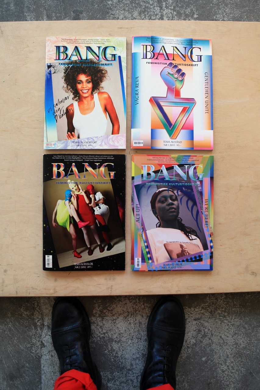
Skuer vi til et annet feministisk tidsskrift av vår tid, nemlig svenske Bang, ser vi tydelig hvordan designerens rolle har forandret seg.
Selv om Biong var involvert i Sirene-redaksjonen, var likevel formgivningen av tidsskriftet i stil med tidens redaksjonelle design. Da Brita Lindvall og Alexandra Falagara, som står bak studioet Bastion – Agency Studio Lab 7
- Bastion skal også formgi Kunsthall Stavangers forestående publikasjon om Judith Bernstein.
Diskursen rundt normkritisk design har sin pre-dominans innen svensk formgivning og går ut på å blant annet utfordre satte visuelle stereotyper og modernismens regler. Med andre ord ser man en sammenheng mellom å akseptere satte samfunnsnormer uten kritisk blikk, og å akseptere visuelle tegn og elementer uten å utfordre grunnen til at de fortsetter å eksistere, og ikke minst representere arkaiske og patriarkalske samfunnsnormer.
Horunge
I en samtale med kunst- og arkitektgruppen MYCKET publisert i Bang i 2013 sier Bastion (som for anledning går under betegnelsen Bang, noe som også hentyder til deres involvering i publikasjonen): «I recently looked at some old projects of mine, and I can see now that they are very normative. It is as if I didn’t see the connection between politics and aesthetics then, not really, anyway. Even if the content is feminist, the setting is based on patriarchal ideas.»
I samtalen prater også MYCKET om hvordan de under sin designutdannelse brukte en hel dag på å lære å tegne en rett linje. Den rette linjen kan på mange måter sies å symbolisere «riktig kjøl», eller altså den patriarkalske og modernistiske formen.
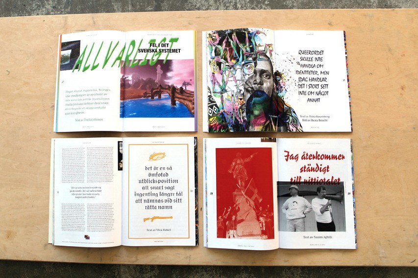
I den trykte teksten hvor vi leser dette brytes rutenettet på layouten opp, fotnotene flyter ut i teksten, og symboler som soler og kyssemunner overtar for tallene i fotnotene. Sidene går fra å være i svart og hvitt til å være i fullfarge, den kolonnebaserte typografien flyter utover, et grotesk typesnitt erstattes av et mangfold av typesnitt, blant dem det dekorative Bermuda. Sitatet som står i Bermuda sier at man leser best den fonten man har lest mest i, og akkurat derfor fortsetter man å bruke denne, uten å stille spørsmål til hvorfor formen ser ut slik den gjør.
I designet av Bang jobber Bastion med flere aspekter av hva feministisk design kan være. For eksempel sier designerne at de konsekvent forsøker å få frem det som i typografien heter «horunge». Ordet er innarbeidet i typografi-feltet, selv om det er både støtende og absurd. Betydningen av «horunge» er når et eller to ord i en tekst settes over på neste side og blir hengende løst fra resten av teksten. Selve betegnelsen har blitt omdiskutert i feltet de siste årene.
I Bang hyller Bastion «horungene», tvinger dem ut – ifølge seg selv som en hyllest til alle barn født utenfor ekteskapet. Alle typesnitt som brukes i bladet er tegnet av kvinner, blant dem Mrs Eaves laget av Zuzana Ličko – en av grunnleggerne av skriftstøperiet og designtidsskriftet Emigre. De eneste unntakene til bruken av typesnitt tegnet av kvinner er titlene, der de bruker det de kaller «belastede typesnitt», blant dem Comic Sans og Mistral. Tidsskriftet er trykket i A4 for å forhindre ekstra kuttemateriale og publikasjonen har heller ikke rygg – dette for å unngå signalisering av status som en rygg innebærer.
Formspråkets aksept
Spørsmålet som følger denne typen normkritisk og feministisk design – som har en tendens til å bruke en bestemt type estetikk – er hvordan man unngår å lage nok et sett med regler slik dem fra modernismen, eller om dette kun er en visuell trend.
I en tekst på nettstedet til organisasjonen ADA skrive Falagara at de jobber med ideer som kan leses i flere lag. «Kombinationerna av de estetiska valen bildar då en mix som är invecklad, där poängen är att den ska hålla för en läsning i flera skikt.» Det er i gestene eller funksjonen av valgene at det normkritiske eller feministiske ligger, forteller Falagara videre. Med andre ord er formen bundet til kriterier utover kun det visuelle.
Dersom vi sier at det er formen som skal følges, blir det også banen for strategien. Men dersom vi sier at formen skal være en gest, slik Falagrava beskriver det, handler det om å innta rollen som Enabler – en «co-creator of meaning». Der man jobber i en performativ dimensjon.
Selv om reflekterende designere har gått bort fra ideen om en objektiv form, har man likevel med seg samfunnsansvaret eller et ønske om å ta det samtidig som man også vekker til live innholdet i budskapet. Slik har altså også designeren en subjektiv egenverdi investert i formen, som ikke fremstår som autonom, men som en samarbeidspartner til feminismens budskap.
Med andre ord ligger den nye feministiske kampen ikke bare i å formidle gjennom budskapet, men også gjennom form.
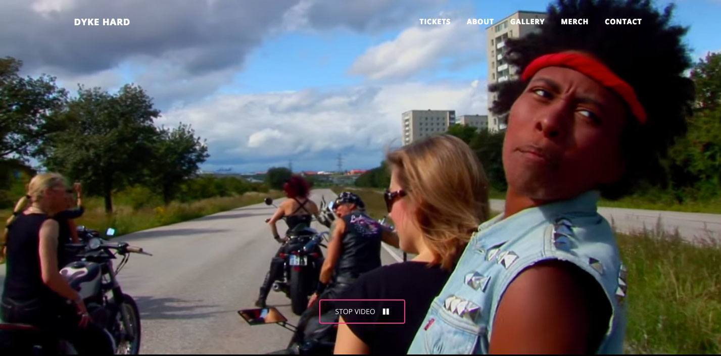
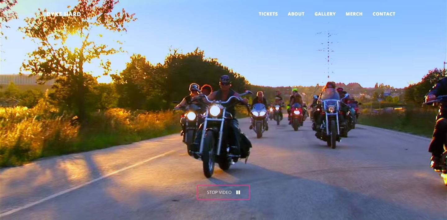
Dyke Hard
La oss vende tilbake til filmens verden. Konstfack er i sitt første år med en mastergrad med vekt på normkritikk, ledet av Johanna Lewengaard og Joanna Rubin Dranger. Tidligere het samme program ”Storytelling”, og var allerede da ladet med noen av de samme ideene om å utfordre normative og diskriminerende maktstrukturer.
Et av resultatene fra Storytelling-programmet var filmen Dyke Hard. En feiring av det normkritiske i John Walter-stil. Flyene har blitt erstattet med motorsykler, kvinnene er ikke bare hvite og kledd i ettersittende antrekk – og de tar ikke beskjeder fra en middelaldrende, hvit mann. «Just get on the bike, dyke!» roper en av rollefigurene til en annen fra baksetet av en motorsykkel.
Her gjennomsyrer feminismen budskapet – fra handling, plot og fremstilling. Man inkluderer designerens rolle både som Communicator, Author og Enabler. Og man knuser det heteronormative, ikke bare med innhold, men også med form.
Design has long since abandoned the notion of a single, universal solution to visual communication, and in so doing most designers have also left the principles of modernism by the wayside. In graphic design, modernist forms have been defined by such elements as grids, basic forms, primary colors, and grotesque typefaces. 8
- A font is part of a typeface. For example, 12-point Helvetica Bold is one font, while 10-point Helvetica Light is another font, with Helvetica as the overarching typeface. Helvetica is also a typical grotesque typeface, meaning among other things that it does not have serifs that embellish the ends of letters. Other grotesque typefaces include Gill Sans, Futura, and Univers, which were greatly appreciated by the modernists
- The Ulm School of Design, founded in 1953 in Ulm, Germany, can be described as continuing the modernist principles of Bauhaus.
- Helmut Draxler, “A Conversation with Helmut Draxler: The Substance of Design,” in In a Manner of Reading Design, ed. Katja Gretzinger (Berlin: Sternberg Press, 2012), 80. Johanna Lewengard, lecture delivered at the Forms of Politics seminar series, Litteraturhuset
This mid-century conviction that designers should be societally responsible emerged concurrently with the idea that design could play a role in changing society. Designers were the objective guardians of the message, even as they had a responsibility for bringing about social change. This also incorporated the notion that there existed a correct type of design, a universal form. It is worth mentioning here that is was largely white men who provided such “correct” answers to the questions of design.
Gender Issues
Issues concerning gender have always been implicit in graphic design, not least because design has been complicit in constructing gender roles. Of course, this implies that the field can also play a part in breaking down such roles. Because design is often seen as a professional service, where the designer merely acts as the objective presenter (as stated above, this is a highly outmoded idea), many find it hard to understand that designers also have their own message that is incorporated in the design process and the product.
Within the field, the designer can in many ways be said to have gone from the objective to the subjective already during the 1960s. Throughout the twentieth century, designers took ever-greater subjective control of how the message was communicated, until designed form itself became recognized and understood as content. In other words, design in the twenty-first century could in a much wider sense be understood as the message, even without the context of a client’s textual input. During a presentation in the fall of 2015, Professor Johanna Lewengard from the Konstfack University College of Arts, Crafts, and Design in Stockholm demonstrated how the designer has gone from enacting the role ofcommunicator to authorand finally toenabler. 11
- Johanna Lewengard, lecture delivered at the Forms of Politics seminar series, Litteraturhuset, Oslo, October 23, 2015. The series was co‑organized by the present author.
Designers today work not only with spreading feminism through content but also by incorporating feminism as a part of the field itself. But before we get to the current state of affairs, let us take a look at how designers have made this journey.
The Design of Sirene
In Norway, modernism held sway in the field of design until far into the 1970s, as evinced in the Norwegian feminist magazine Sirene, a publication that was most recently featured at the 2013 exhibition Norwegian Art and Feminism 1968–89 (subsequently displayed at Kunsthall Stavanger in 2014). In 1973, Sirene sold out its trial issue with a print run of 35,000 copies—utopian sales figures for today’s magazines, whether with or without a feminist slant. Sirene continued to be published for a decade, and throughout most of this period the graphic designer Sissel Biong was a member of the editorial staff and in charge of the layout. As with the other employees at the magazine, Biong had an editorial responsibility and took equal part in the decision-making, as did the rest of the staff.
The editorial staff at Sirene wrote about periods, cystitis, and topics that until then had been underrepresented or entirely withheld by Norwegian media. Select article titles include “The Warped Ideal of Masculinity” and “Suzanne Brøgger: ‘Marriage, the Cannibalism of Today,’” while cover titles included “Norwegian Divorces (Poor Daddy),” “Gloria Steinem: ‘Erotica and Pornography—Of Course There’s a Difference,’” and not least the simple but catchy “Orgasm.”
Sirene was a two-color publication in red and black. The color red can be said to belong to the political Left but is also a color that is clearly visible against a white background, which is perhaps the primary reason it was used. Biong’s choice of typefaces used in the editorial design of Sirene was a combination of modernist grotesque and Antiqua typefaces, 12
- Helvetica is an example of a grotesque typeface, more specifically a sans-serif typeface. A serif is an additional embellishment at the end of letters. A typical (French Renaissance) Antiqua typeface is Garamond. All Antiqua typefaces have serifs.
In a Norwegian context, Sirene proved to be the first sign that the designer’s role in feminist communication went from being a subordinate facilitator to being a co‑author and a subjective voice.
Pussy Galore!
Blazing through the skies! Pussy Galore and her sisters-in-crime! A wicked gang of women in cahoots with a traitor to the free world!
This is how the character Pussy Galore is presented in the James Bond movie Goldfinger (1964). The film portrays Galore and her co‑conspirators—the all-female Flying Circus—as independent women who have joined forces with the main villain, Auric Goldfinger (named after Ernő Goldfinger, the modernist architect known for the Trellick Tower in London). Goldfinger is a gold-obsessed megalomaniac who, with Galore’s help, plans to steal the US gold reserves in Fort Knox and transfer them to the Soviet Union.
In the Bond universe of the 1960s, the woman as an independent person is thus a threat to the free, Western world. Though Galore and her Flying Circus ultimately betray Goldfinger and side with James Bond, the reason, according to the Bond series’ original writer Ian Fleming, is that Galore as a lesbian woman only needs to meet the right man so that she can be cured of her “psycho-pathological malady”—and find her way back to the straight and narrow while she’s at it. 13
- Alison Flood, “Ian Fleming: Pussy Galore Was a Lesbian . . . and Bond Cured Her,’” The Guardian, November 4, 2015, https://www.theguardian.com/books/2015/nov/04/ian-fleming-bond-cured-pussy-galore-psycho-pathological-malady-lesbian.
- Published from 1990 to 1996 by the editor and designer Neville Brody, FUSE was a postmodern platform for experimental typeface, with each issue featuring four fonts and an accompanying essay.
- Triggs is the present author’s former professor.
- “WD+RU,” Grafik, March 9, 2015, https://www.grafik.net/category/feature/wd-ru.
This is an example of the form itself being used to communicate the message. The typeface was both the messenger and the message, but they did not exist as two different elements: it was rather a case of the hierarchy becoming flatter, with the designer going from being a mere communicator to also being an author of the message. However, the font was only a series of typeface forms. There were no further guidelines for how to create other feminist typefaces or how to use the Pussy Galore typeface to continue spreading the feminist message.
Pussy Galore thereby exists as a halfway stage between Sirene and current feminist design. With it, the designer is an author but not yet an enabler.
The Patriarchal Idiom
If we take a look at another feminist magazine from the present day, namely, the Swedish magazine Bang, we clearly see how the designer’s role has changed.
Even though the designer Sissel Biong had been a member of Sirene’s editorial staff, the magazine’s design nonetheless followed the conventional practices at the time. By contrast, when Brita Lindvall and Alexandra Falagara, founders of the Bastion design studio, took over the design of Bang, they also created a so-called feminist and norm-critical design. Such design, which has predominantly been practiced in Sweden, seeks among other things to challenge fixed visual stereotypes and modernist rules. In other words, the norm-critical discourse sees a connection between accepting conventional social norms without critical scrutiny and accepting visual signs and elements without challenging the reasons for their continued existence, as representatives of archaic and patriarchal social norms.
“Child of a whore” In a conversation with the art and architecture group MYCKET published in Bang in 2013, Bastion—going for the occasion under the name of “Bang,” which also alluded to their personal involvement in the magazine—touched on their previous work: “I recently looked at some old projects of mine, and I can see now that they are very normative. It is as if I didn’t see the connection between politics and aesthetics then, not really, anyway. Even if the content is feminist, the setting is based on patriarchal ideas.” 17
- MYCKET, “Circumnavigating and Crushing,” trans. Hedvig Marano, Bang no. 2 (2013): 30, accessed November 30, 2017, https://drive.google.com/file/d/0B-2U8_IJFlwOSXJ0N1FNbnZlTG8/view.
In the design of the piece in Bang, the grid gradually becomes distorted, the footnotes spill out into the main text, and symbols such as suns and kissy lips replace the standard footnote numbers. The pages go from being black-and-white to being full-color, the column-based typography spills out, the single grotesque typeface is replaced by a wide array of typefaces, including the decorative Bermuda. Demonstrably, the quotation that is set in Bermuda notes that people read best in the font they are most accustomed to reading, which is precisely why they continue to read in it and use it, without questioning why the font looks as it does.
During the time period that Bastion designed Bang (2012–2015), they worked on a variety of aspects of what feminist design could be. For example, the designers stated that they consistently tried to accentuate what in typography are known as orphans, that is, one or two words in a text that spills over to the next page and remains detached from the rest of the text. In Swedish and Norwegian, such a typographical orphan is known as a horunge—literally, “child of a whore.” Despite being both offensive and absurd, the word has established itself in Swedish and Norwegian typography, although it has in fact become increasingly controversial in recent years. 18
- At the time the piece in Bang came out, this term was still in use in Sweden, but today it has been renamed ensamrad (lit. “lonely row”). In Norway the term horunge is still in use.
In Bang, Bastion celebrated such “children of a whore” and brought them to the fore—according to the designers themselves, they did so as an homage to all children born out of wedlock. All the typefaces used by the magazine were designed by women, including the Mrs Eaves typeface created by Zuzana Ličko, one of the founders of the Emigre type foundry and its eponymous design magazine. The only exceptions to using typefaces designed by women were the titles, where they used what they call “negatively connoted typefaces,” including Comic Sans and Mistral. The magazine was printed in the standard A4 format (21 x 29.7 cm) in order to avoid additional waste from trimming, and the publication also eschewed a spine so as to avoid the status signaled by book spines.
Accepting an Idiom
The question that arises in connection with this type of norm-critical and feminist design—one that has a tendency to use the same type of aesthetics—is how to avoid creating yet another set of rules like the modernist ones, or whether such design is only a passing visual trend.
In regard to such a question, Bastion’s co‑founder Alexandra Falagara notes that they work on ideas that can be read at different levels, in which case “the combinations of the aesthetic choices then form a complex mix, where such a mix should lend itself to a multilayered reading.” 19
- Alexandra Falagara, “Normkritisk formgivning—vad är det?,” ADA, August 21, 2014, http://www.adasweden.se/artikel/normkritisk-formgivning-vad-ar-det/.
If we declare that it is the form that is to be followed, that also seems to be the demise of the strategy. But if we say that the form should be a gesture, as Falagara describes it, it is a matter of assuming the role of an enabler, as a co-creator of meaning, where the designer works in a performative dimension.
Even though designers who work with a critical approach have abandoned the notion of an objective form, they have nonetheless retained the idea of social responsibility and the desire to take such responsibility, at the same time as they reenergize the content of the message being conveyed. In that manner, the designer also has a subjectively intrinsic value invested in the form, one that is not autonomous but is a partner to feminism’s messages.
In other words, the new feminist struggle is a matter of presenting its ideas not only through the message but also through the form.
Dyke Hard
Let us return to the world of movies. Konstfack in Sweden is currently in its third year of organizing a master’s degree program that focuses on norm criticism, as led by Johanna Lewengaard and Joanna Rubin Dranger. The same program was previously known as “Storytelling” and was already at the time underpinned by some of the same ideas concerning challenging normative and discriminatory hierarchies.
One of the results of the Storytelling program was the film Dyke Hard (2014), a celebration of the norm-critical discourse in the style of John Waters. The airplanes have been replaced by motorbikes, the women are no longer only white and dressed in tight-fitting clothes—and they don’t take orders from a white, middle-aged man, as in Goldfinger. “Just get on the bike, dyke!” one of the characters yells to another from the back of a motorbike.
The message here is steeped with feminist ideas, from action and plot to portrayal. It includes the designer’s role as communicator, author, and enabler alike. And it demolishes the heteronormative not only with content but with form.