Journal

EN
28/03/19 • Essay : Sam Holleran

Focus on the Flag: How Contemporary Artists are Mobilising an Age-Old Form

EN
28/03/19 • Essay : Sam Holleran

Focus on the Flag: How Contemporary Artists are Mobilising an Age-Old Form

Throughout history flags have stood as simple, striking representations of people groups, directives, and socio-political movements. Concurrently, the recognizable image of flags and their graphic quality render them an attractive media for artists. Below, writer and artist Sam Holleran explores the mutability of flags and their presence in the visual arts.

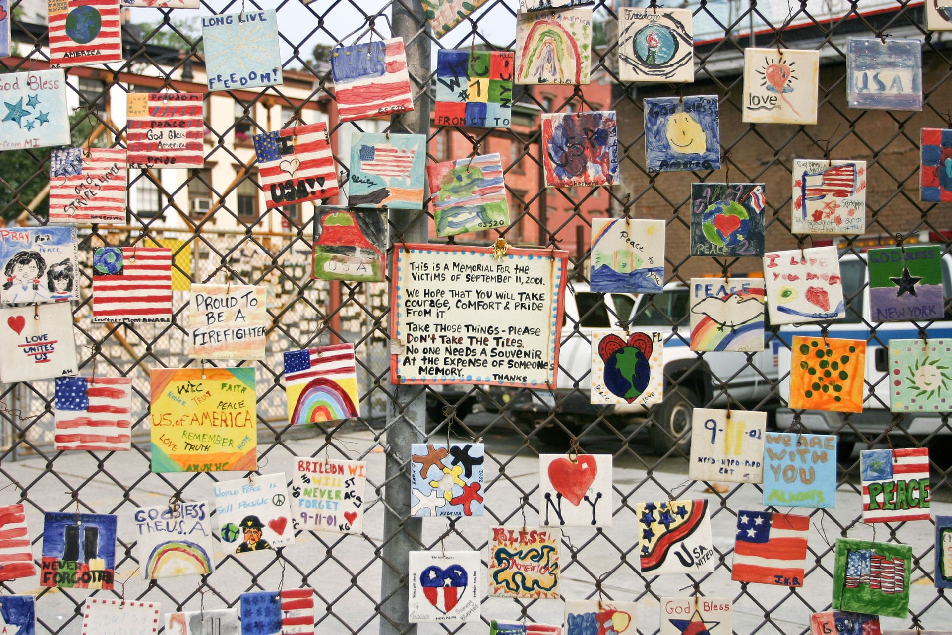
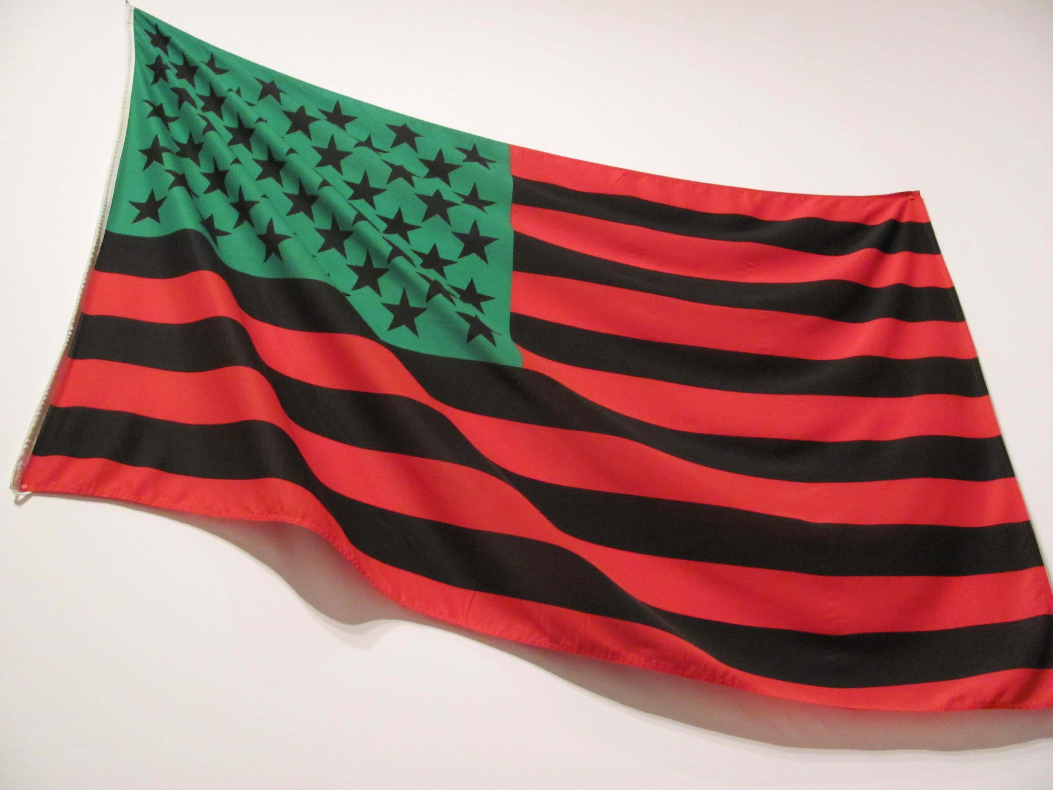
Flags are routinely associated with crass forms of nationalism. In Europe, national flags are sometimes associated with far-right parties and football hooliganism. In Germany, until very recently, displaying the black, red, and gold on one’s house was understood to be a clear endorsement of a certain kind of revanchist politics. While the flag is a symbolic distillation of political and ideological sentiment into a graphic form, it is very much a medium, and not a message. Flags don’t convey one elemental ideology but are freighted with myriad, disparate identities. This dissonance has been appealing to artists throughout time.

In recent years, campaigns have been launched to both rework flags or, more radically, eliminate them, including Rem Koolhaas’s polemical pan-European symbol. Debuted in 2001, the design humorously fuses the stripes of the EU member state flags into a multicolored barcode; a snide comment on the evolution of national identity into rootless global consumer culture. In the thin ribbons of color one nearly loses the individuality of each flag, the red and white of Denmark and Austria are barely distinguishable, and that’s the point: flags, in 2001, were a thing of the past, destined for history’s ash heap. But in the intervening years we have seen a flag-waving resurgence: from the post-9/11 plastering of the American flag across nearly every available surface, to the resurgent flags of Euro Nationalist movements, and the crude typography of the ISIL banner. To see flags as simply relics of the past is to ignore their emotional pull, whether it be national, ethnic, or regional, they still have affective power over the vast majority of us. Artists are keenly aware of this, and the flag has been, and continues to be, a thematic touchstone. The form is a shorthand for issues of identity and belonging.

Wall-to-wall American flags appeared in New York, and across the United States, after 9/11. Image: David Iliff.

Playing spot-the-flag in an art museum is a relatively easy and fun game because flag forms pop in and out of historical movements in art. One can amble from the naval landscapes of 19th century Britain, to the precisionist paintings of the 1920s, to the proto-Pop Art of Jasper Johns (aka “the flag guy”), and into the protest-driven works of 1960s, cataloging flag specimens all along the way. There are few symbols that carry such universal recognition, and, as a result, provide so much opportunity for visual remixing. The graphic simplicity of flags makes them ease to perceive and disseminate, as a design standard they function as visual ‘tunes’ that are so well-known they can very easily be taken as the basis for a wide variety of improvisations.

Heraldry is, of course, ancient. Graphic devices that distinguished families, groups, and religious movements were scratched into doors and painted on stones way before the advent of the nation state. But today’s flags are mostly the result of the nation-building push of the late 18th century (like the tricolours of France, Germany, Mexico, and Ireland) and the decolonization of the 1960s (often defined by angular forms and indigenous motifs). It was modern states that had the power to circulate the flag-symbol in never before seen quantities. In 1801, the emergent British Empire unified the flags of England, Wales, and Scotland—literally stitching together kingdoms into the Union Jack we know today. By the height of their dominion, thousands of Union Jacks were being rolled out per day in British textile mills to fly on colonial buildings from Halifax to Hong Kong. The British flag is one of the most circulated design objects ever created, seconded only by its imperial successor, the Star Spangled Banner, which is reproduced 150 million times per year.

Scores of new flags were born in the post-colonial shake up of the 1960s, with dozens of countries emerging from teetering empires in need of new colors. Post-independence flags helped to distinguish young states and jump-start new civic identities. In 1963, Kenya traded British colors for a flag defined by the red, black, and green of the Pan-African movement with a traditional Maasai shield and spears in the center. English remained an official language and high tea continued to be served in Nairobi, but the country’s visual calling-card became unequivocally African. In Canada, the introduction of the maple leaf in the 1960s successfully ‘rebranded’ the nation. The country’s de-facto flag had been the Red Ensign: a Canadian coat of arms against a red ground, with a Union Jack in the upper left. The ensign was loved by many, including the scores of veterans from both world wars who had fought under it, but it proved problematic as the country became more involved with international peacekeeping missions. During the 1956 Suez Crisis, Egypt’s president, Gamal Abdel Nasser, objected to Canada’s participation in the UN force because their flag too closely resembled that of the British belligerents. Plans for a new flag were floated soon after, but it took nearly a decade, a nation-wide design contest, and a heated parliamentary debate before the maple leaf flag came to be.

At New York’s Scandinavia House benign nationalism becomes a design element. Image: Sam Holleran.

The 11-point maple leaf has become iconically Canadian. It symbolically renders the complexities of a geography and culture that stretches for 9,000 kilometers into a tiny vector object that can be deployed as small as an apostrophe and as large a zeppelin. While the Red Ensign featured Canada’s official heraldry—derived from the ‘strains’ from which it came (namely a Union Jack, fleur-de-lis, and a harp), the new, modern icon hints only at where it was going. The flag made an early appearance at the 1967 Expo in Montreal, flanking Buckminster Fuller’s geodesic dome, another great icon of modernism. The event anticipated the nation-branding expos and mega-events that have become commonplace, and Canada has been extremely savvy in marketing itself in the years since. In 1980, Pierre Trudeau (père of the current prime minister) introduced the national wordmark: “Canada” cleanly set in Baskerville, with a tiny flag flying from the ascender of the ‘d.’ In so doing, it was the first country to set up a graphic identity program at the federal level, meaning that—just like Nike, Apple, and Starbucks—the country issued a style guide with guidelines for the appropriate use of its logo. The way that we understand Canada as a country has, in some ways, been managed by this sophisticated branding campaign that helped them to pull away from both their colonial heritage (and their fitful neighbor to the South).

Campaigns to create new national flags offer rich and under-examined areas for design scholarship. Archival material is abundant. In Canada alone there are thousands of sketches from the 1960s push for the maple leaf. Exhibition catalogues from shows like “New Glory: New Designs for Flags,” a 1976 installation at MoMA, help us to see burgeoning post-colonial symbols at their moment of inception. It’s one of the few times when the graphic arts—and art in general—come front and center in national discourse.

The changes set in motion in the 1960s by the fall of European Empires continue to this day, evidenced by recent fights over the Commonwealth flags of New Zealand and Australia. Efforts to replace their Union Jacks with symbols local to the antipodes—the Southern Cross constellation in the case of Australia, and a silver fern for New Zealand—have ended in stalemate. However, both countries have subtly begun to augment colonial heraldry with the flags of indigenous groups. In dozens of Australian cities the Aboriginal flag—developed in 1971 as a unifying banner for all native peoples—is flown next to the national flag on government buildings. How these design works live and function once released in the world is bit more complicated. Harold Thomas, the creator of the Aboriginal flag, has struggled to maintain copyright over his design, and to keep it out of the hands of anti-immigrant groups who have recently seized on it as a symbol. While recognized and widely celebrated, the movement to adopt the flag has also fed into Australia’s post-Empire rift, where growing indigenous pride has come up against an old guard of Anglo-philia that often smacks of white supremacy.

Flags have helped to crystalize new forms of allegiance. David Hammons’s “African-American Flag” from 1990 is perhaps the most famous of these. What started as an art object—made for temporary display at an Amsterdam exhibition of African American artists—quickly proliferated. Hammons, who began his career with street interventions, certainly foresaw the potential of the flag object and the performative effect of hoisting it above an art institutions that, in 1990, only rarely displayed work by artists of color. The flag’s green, black, and red stars and stripes harken back to Marcus Garvey’s Pan-African tricolor, but they also invert the shades of ‘Old Glory,’ asserting both the contributions of black Americans to the country, and a new sovereignty.

The African-American Flag, a piece created in 1990 by David Hammons that has been shown across the world. Image: Rocor via Flickr.

Hammons’s piece arrived during the last round of culture wars in the United States. In the early 1990s, Flag Burning Bills served as a proxy fight for the political right. Artists responded in clever ways with work challenging the flag’s primacy. In response to a bill that would levy a fine on anyone desecrating the flag, the artist Barnaby Evans’s froze a flag in a 2 meter square block of ice. The piece, Protecting the Flag, ostensibly preserves the national colors from nerdowells, while simultaneously desecrating it: over the course of the installation the flag sank into a puddle produced by the melting ice.

Flags shouldn’t be confused with their close cousin, the banner, which is also having a bit of a renaissance in an art world increasingly animated by current events. Sixteen artists were commissioned as part of Creative Time’s “Pledges of Allegiance” series from 2017, and most ended up making some form of flag-banner hybrid. One of the most memorable was Marilyn Minter’s “Resist,” a drippy one-word cri de cœur scrawled across a midnight blue banner. It was hoisted up in June of 2017 (the first of the series to be flown), just as the public institutions, including museums and art institutions, were being increasingly attacked by Trump and his supporters. Even before the current culture war fanned the flames of white supremacy and the targeting of those perceived as “coastal elites,” banner art and protest flags were already in the public eye thanks to ground-up movements like Occupy Wall Street and Black Lives Matter. Dread Scott’s “A Man Was Lynched by Police Yesterday” banners take inspiration from the activism of the National Association for the Advancement of Colored People (NAACP) in the 1920s and 30s. During that period, the NAACP would hang a flag from its Fifth Avenue headquarters to call attention to lynchings in the American South. In 2015, when numerous videos emerged of black men dying by the hand of law enforcement, Scott added the word “police,” and arranged for the nylon banner to be flown from Jack Shainman Gallery in Manhattan. The piece uses the ceremonial space reserved for flags to highlight one of the biggest cracks in America’s self image.

Today, nationalism is once again on the rise with accompanying flag-waving. Simultaneously, the flag—and in particular the ubiquitous American flag—has been reworked by savvy emerging artists. After a visit to the U.S.-Mexico border in 2015, the artist Laura Serejo Genes returned to her studio with a spool of fencing wire and, over a period of months, began to make coils that resulted in a chainmail flag sculpture. The sculpture is both a rugged armament (it weighs well over 20 kilos), and an ethereal shroud. “The chain-mail flag is,” as Genes notes, “a personal meditation on both the weight and malleability of the American mission.”

While Genes’s work attempts to find a new frame for national identity, many artists want to smash nationalism altogether. When asked to make a temporary sculpture for a Spanish festival, the artist and illustrator Javier Jaén worked with José Lafarga to create a giant white flag. Made from carefully-crafted wood and plaster, the piece was part of Fallas—an annual festival in Valencia during which temporary monuments are erected across the city, only to be dramatically burnt after three weeks of installation. Jaén’s blank flag became a canvas onto which all the flags of the world were projected (while loudspeakers cycled through the corresponding national anthems). On the final evening the flag, which was packed with firecrackers, was set ablaze, and old nationalisms went up in flames as a crowd of thousands of revelers looked on.

Symbolically, exploding the flags of the world is one way to break down old guard nationalism, but it’s not the only way. Others have looked to remix national sentiment, repurposing it for more gentle nation-states or undetermined political configurations of the future. Kunsthall Stavanger’s flag series, commissioned in 2014 and curated by Randi Grov Berger, use the ur-form to ask questions about citizenship and belonging in an age increasingly characterized by migration and trans-national digital communities. The 60 works run the gamut of graphic styles, sometimes hovering at the edge of recognizability as a flag. Magnhild Øen Nordahl created one of the most bold graphic forms with Dit (or “there” in English). It features a blue arrow on a white ground pointing away from the flagpole, and—because it was flown in Bergen, Stavanger, and New York under different weather conditions and prevailing winds—the “there” is constantly shifting, destabilizing the flag as a means of communication, and pointing at the fickleness of flag-based identities.

Magnhild Øen Nordahl’s flag “Dit” created for Kunsthall Stavanger’s 2014 exhibition, Flag.

With the recent death of Gilbert Baker, the San Francisco-based artist and activist who designed the LGBT+ rainbow flag, there has been renewed interested in flags as design objects. Baker’s flag entered the collection of MoMA in 2015, joining Hammons’s African-American flag (acquired in 1997). They are by no means the only flag-based works in the museum, but they stand out because of their sincerity. Others, particularly the Pop arts, dip into the world of vexillography, but they do so in a tongue-and-cheek manner, skewering the symbols of nationalism and, by proxy, those who trust in them.

Visual thinkers have turned to flag design and heraldry to find inspiration in the form’s graphic constraint, and power in the rituals built around nationalist objects. Many want to create durable imagery for social movements but often struggle to see where they fit in—flags offer a straightforward way to launch projects in a political vein. The ubiquity of flags and the emotional freight they carry makes them an ideal canvas for artistic experimentation. Flags hold real power in their symbolism, and that’s something artists should be cognisant of. Using the flag form just to knock nationalism is no doubt too easy, their works can suggest new modes of belonging and community.


Sam Holleran is a writer, interdisciplinary artist, and designer. His writing and research on graphic culture, urbanism, and architecture has appeared in publications like Urban Omnibus, PRINT, Public Books, and The Avery Review. He has worked with numerous nonprofits, community-based organizations, and educational institutions to create participatory planning projects, community design programs, and public art installations in and around city parks. Formerly a researcher at the Chair of Architecture and Urban Design at ETH-Zürich, he is currently the Urban & Social Design Lead at Ellery Studio, Berlin.